iyeung144.github.io
My Github Pages
RMSC5001 Project 2018-2019 - Principal Component Analysis
by CHING, Pui Chi 1155102106
MA, Cheuk Fung 1155106595
YEUNG, Ka Ming 1155104060
Introduction
“I never had a problem reaching a decision based on imperfect information. That’s just the way the world works.” ― Alex Ferguson, Leading: Learning from Life and My Years at Manchester United[1]
Legendary football manager Sir Alex Ferguson surely never had a problem in managing Manchester United from 1986 to 2013. However, for other clubs who try to win the English Premier League, they may have to rely on other insights to achieve this goal.
Principal component analysis will be one of the keys to answer this question.
Abstract
- Problem
- What make a team win?
- In what way some teams are better than the others?
- Dataset description
- The English Premier League (EPL) Season 2017-2018 statistics. It is downloaded from DataHub (https://datahub.io/sports-data/english-premier-league). Details of the dataset will be discussed below.
- Method to use
- Principal component analysis. The reasons of using PCA can be
summarized as follow:
- The main idea is trying to capture as much information as possible while reducing the complexity of problems for easier analysis. Each principal component (PC) is a linear combination of the variables makes up a principal component. The loadings show the relative importance of the variable of each PC.
- Meaningful 2D plot can be made instead of handling fancy high dimenisonal plots.
- No need to define dependent variable or make assumption on underlying distribution of variables. It gives flexibility in analysis the problem.
- Findings
- Home Team performance and number of foul plays are crucial in determining how clubs rank in the final standing.
- Conclusion
- Principal componenet analysis can sort out the winning elements and help club managers to run their clubs.
Set Up
Library
library(corrplot)
library(ggplot2)
library(ggthemes)
library(tidyverse)
library(zoo)
library(factoextra)
library(FactoMineR)
library(knitr)
Data field legend
The season 2017-2018 statistics is downloaded from DataHub. These data contain the results of 380 EPL matches. There are total 22 variables with 12 variables measuring the team play statistics. Below is the descriptive information of the dataset.
| Field.Name | Order | Type..Format. | Description |
|---|---|---|---|
| Date | 1 | date (%Y-%m-%d) | Match Date (dd/mm/yy) |
| HomeTeam | 2 | string (default) | Home Team |
| AwayTeam | 3 | string (default) | Away Team |
| FTHG | 4 | integer (default) | Full Time Home Team Goals |
| FTAG | 5 | integer (default) | Full Time Away Team Goals |
| FTR | 6 | string (default) | Full Time Result (H=Home Win, D=Draw, A=Away Win) |
| HTHG | 7 | integer (default) | Half Time Home Team Goals |
| HTAG | 8 | integer (default) | Half Time Away Team Goals |
| HTR | 9 | string (default) | Half Time Result (H=Home Win, D=Draw, A=Away Win) |
| Referee | 10 | string (default) | Match Referee |
| HS | 11 | integer (default) | Home Team Shots |
| AS | 12 | integer (default) | Away Team Shots |
| HST | 13 | integer (default) | Home Team Shots on Target |
| AST | 14 | integer (default) | Away Team Shots on Target |
| HF | 15 | integer (default) | Home Team Fouls Committed |
| AF | 16 | integer (default) | Away Team Fouls Committed |
| HC | 17 | integer (default) | Home Team Corners |
| AC | 18 | integer (default) | Away Team Corners |
| HY | 19 | integer (default) | Home Team Yellow Cards |
| AY | 20 | integer (default) | Away Team Yellow Cards |
| HR | 21 | integer (default) | Home Team Red Cards |
| AR | 22 | integer (default) | Away Team Red Cards |
Data exploration
The EPL has 20 clubs and each club will play the others twice in the season, once at their home stadium and once at that of their opponents’, for 38 games. Therefore the total number of records are 20 x 19 of 380 with 12 independent variables, which makes up 4,560 data points. The analysis can be easily extended to include other seasons. However, for simplicity, our study just use Season 2017 - 2018.
Game play statistics are independent variables to explain the game, i.e. variance of the game, while the output are game results. Only variables from 11 to 23 are used for principal component analysis. Besides, the analysis is based on HomeTeam data. AwayTeam can be done in the same way.
set.seed(123456)
d <- read.csv("season-1718_csv.csv", stringsAsFactors = FALSE)
d1 <- d %>%
  group_by(HomeTeam) %>%
  summarise(
    HS = sum(HS),
    AS = sum(AS),
    HST = sum(HST),
    AST = sum(AST),
    HF = sum(HF),
    AF = sum(AF),
    HC = sum(HC),
    AC = sum(AC),
    HY = sum(HY),
    AY = sum(AY),
    HR = sum(HR),
    AR = sum(AR)
  )
league.df <- column_to_rownames(d1, var = "HomeTeam")
(league.df)
##                 HS  AS HST AST  HF  AF  HC  AC HY AY HR AR
## Arsenal        341 184 146  69 186 195 130  93 25 23  1  2
## Bournemouth    267 256  82  85 165 207 115  84 31 35  1  1
## Brighton       217 243  71  87 198 152  90  98 37 16  1  1
## Burnley        207 263  66  80 167 227  94 110 27 16  0  4
## Chelsea        356 168 132  51 183 222 148  70 19 33  3  1
## Crystal Palace 267 206  91  81 215 215 104  96 38 36  0  2
## Everton        189 241  60  81 234 196  81  99 28 23  1  2
## Huddersfield   207 186  55  77 180 180 102  83 26 32  2  1
## Leicester      227 216  75  69 180 195 112  89 22 28  2  1
## Liverpool      359 118 135  37 166 161 134  62 18 28  0  0
## Man City       347 106 151  40 169 180 138  47 26 40  1  2
## Man United     275 176  93  65 204 219 117  75 29 33  0  0
## Newcastle      224 218  71  65 207 205  83  95 23 35  2  0
## Southampton    252 223  77  74 190 200 125  89 29 25  0  1
## Stoke          203 264  65  97 219 198  80 128 30 23  1  0
## Swansea        214 222  69  86 196 213  95  81 24 40  0  0
## Tottenham      353 171 120  62 177 202 143  71 20 36  0  0
## Watford        236 209  70  81 224 206  96  92 41 36  2  3
## West Brom      210 229  65  68 230 172 101  87 35 30  0  0
## West Ham       211 226  64  75 193 237  93  78 34 27  0  1
summary(league.df)
##        HS              AS             HST              AST
##  Min.   :189.0   Min.   :106.0   Min.   : 55.00   Min.   :37.0
##  1st Qu.:210.8   1st Qu.:182.0   1st Qu.: 65.75   1st Qu.:65.0
##  Median :231.5   Median :217.0   Median : 73.00   Median :74.5
##  Mean   :258.1   Mean   :206.2   Mean   : 87.90   Mean   :71.5
##  3rd Qu.:291.5   3rd Qu.:232.0   3rd Qu.: 99.75   3rd Qu.:81.0
##  Max.   :359.0   Max.   :264.0   Max.   :151.00   Max.   :97.0
##        HF              AF              HC               AC
##  Min.   :165.0   Min.   :152.0   Min.   : 80.00   Min.   : 47.00
##  1st Qu.:179.2   1st Qu.:191.2   1st Qu.: 93.75   1st Qu.: 77.25
##  Median :191.5   Median :201.0   Median :103.00   Median : 88.00
##  Mean   :194.2   Mean   :199.1   Mean   :109.05   Mean   : 86.35
##  3rd Qu.:209.0   3rd Qu.:213.5   3rd Qu.:126.25   3rd Qu.: 95.25
##  Max.   :234.0   Max.   :237.0   Max.   :148.00   Max.   :128.00
##        HY              AY              HR             AR
##  Min.   :18.00   Min.   :16.00   Min.   :0.00   Min.   :0.0
##  1st Qu.:23.75   1st Qu.:24.50   1st Qu.:0.00   1st Qu.:0.0
##  Median :27.50   Median :31.00   Median :1.00   Median :1.0
##  Mean   :28.10   Mean   :29.75   Mean   :0.85   Mean   :1.1
##  3rd Qu.:31.75   3rd Qu.:35.25   3rd Qu.:1.25   3rd Qu.:2.0
##  Max.   :41.00   Max.   :40.00   Max.   :3.00   Max.   :4.0
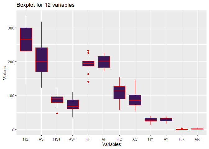
ggplot(stack(league.df), aes(x = ind, y = values)) +
  geom_boxplot(fill = "#3d195b", colour = "red") +
  labs(
    x = "Variables",
    y = "Values",
    title = "Boxplot for 12 variables"
  )
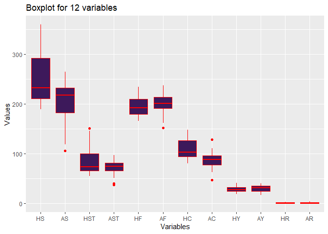
Some facts can be concluded from the boxplot:
- Home Team is more aggressive in attack. This is supported by higher Home Shot, Home Shot on Target and Home Corner values.
- Fouls are comparable between Home Team and Away Team.
Correlation plot
r <- cor(league.df)
corrplot.mixed(r, lower = "square", upper = "number", order = "FPC")
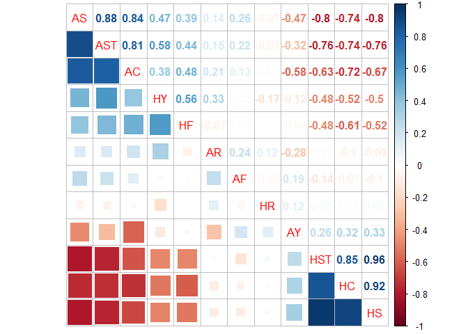
Some facts can be concluded from the correlation plot:
-
The highest negative correlation -0.8 AS to HS. If one team controls the game, the attack is sereve and it can turn the opponent defensive.
-
Shoot on Target will lead to more more Corner Kick, so AST is positively related to AC, with 0.81.
-
Home Foul is negatively related to Home Shot, which can be interperted as better play with better sport manner.
-
While Away Foul is not strongly correlated to other factors. Red Card factor is comparable between Home Team and Away Team, which can be interperted as Red Card is an event not related to attack or defence statistics, maybe it is more a referee related issue.
-
All Home-related and Away-related factors are negatively correlated to each other, which is a resonable representation.
Methodology
The theory behind principal component analysis (PCA) is to reduce the dimensionality of a data set consisting of a large number of correlated variables, while preserving as much as information present in the data set. To achieve this goal, a new set of variables, the principal components (PCs), are constructed by transforming from the original variables. The PCs are uncorrelated and sorted by the highest variance explained to the lowest. To illustrate, if there are 5 PCs, PC1 will be the first principal component that explained the most variance of the original variables’ covariance matrix.
For PCA, prcomp is used because according to literature[2], prcomp uses singular value decomposition which is generally the preferred method for numerical accuracy.
Summary of PCA
pca <- prcomp(league.df, center = TRUE, scale = TRUE)
summary(pca)
## Importance of components:
##                          PC1    PC2    PC3     PC4    PC5     PC6     PC7
## Standard deviation     2.427 1.1648 1.1065 1.03176 0.9992 0.74891 0.64172
## Proportion of Variance 0.491 0.1131 0.1020 0.08871 0.0832 0.04674 0.03432
## Cumulative Proportion  0.491 0.6041 0.7061 0.79483 0.8780 0.92476 0.95908
##                            PC8     PC9    PC10    PC11   PC12
## Standard deviation     0.47133 0.34027 0.27169 0.24999 0.1296
## Proportion of Variance 0.01851 0.00965 0.00615 0.00521 0.0014
## Cumulative Proportion  0.97759 0.98724 0.99339 0.99860 1.0000
PCA results
Scree Plot
fviz_screeplot(pca,
  addlabels = TRUE, ylim = c(0, 50),
  main = "Screeplot of the first 10 PCs",
  barfill = "#3d195b", barcolor = "#3d195b"
)
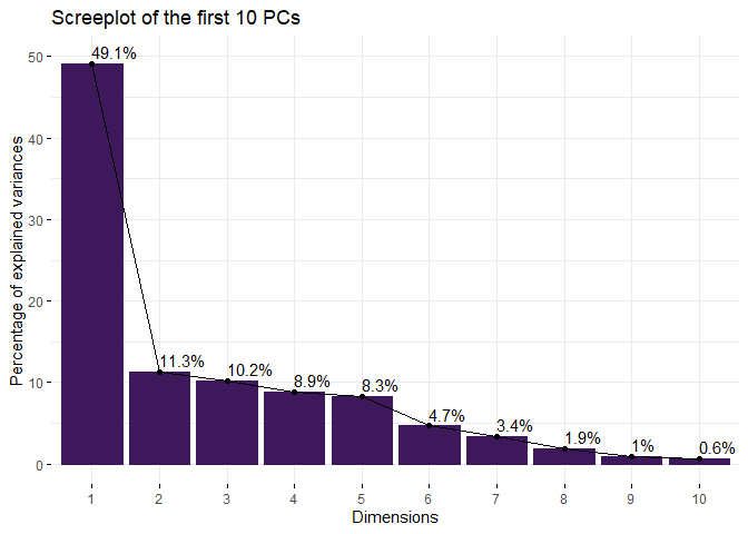
The first five PCs explain 87.80% of total variance.
Quality of representation
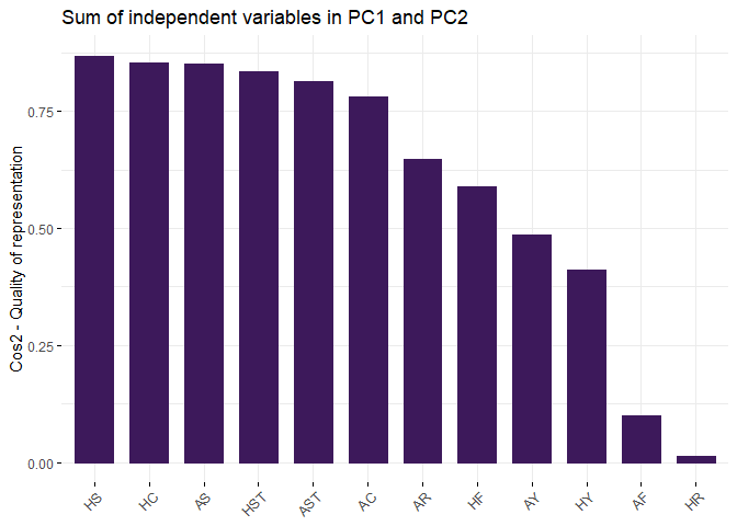
By the below plot, PCs beyond PC5 have little significance to the analysis.
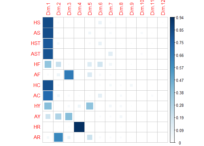
var <- get_pca_var(pca)
corrplot(var$cos2, is.corr = FALSE, method = "square")
# Total cos2 of variables on PC1 and PC2
fviz_cos2(pca,
  choice = "var", axes = 1:2,
  title = "Sum of independent variables in PC1 and PC2",
  fill = "#3d195b", color = "#3d195b"
)
Eignevalues analysis
zapsmall(get_eigenvalue(pca))
##        eigenvalue variance.percent cumulative.variance.percent
## Dim.1     5.89234         49.10284                    49.10284
## Dim.2     1.35679         11.30657                    60.40941
## Dim.3     1.22427         10.20226                    70.61167
## Dim.4     1.06452          8.87100                    79.48267
## Dim.5     0.99838          8.31979                    87.80246
## Dim.6     0.56086          4.67387                    92.47634
## Dim.7     0.41181          3.43174                    95.90808
## Dim.8     0.22215          1.85124                    97.75932
## Dim.9     0.11579          0.96488                    98.72421
## Dim.10    0.07381          0.61511                    99.33932
## Dim.11    0.06249          0.52078                    99.86010
## Dim.12    0.01679          0.13990                   100.00000
Since the eigenvalues beyond PC5 are significantly less than 1, according to Kaiser Rule, which mean they are explaining less variance than one independent variable. Therefore, total 5 PCs will be used.
Contribution for loadings of each PC
(zapsmall(var$contrib[, 1:5]))
##        Dim.1    Dim.2    Dim.3    Dim.4    Dim.5
## HS  14.38937  1.51669  0.02446  0.53439  0.78434
## AS  14.13506  1.40576  0.00005  0.01467  5.86522
## HST 13.50251  2.83039  0.12417  0.37533  2.69839
## AST 13.75937  0.16770  0.56088  0.12155  0.95727
## HF   6.36282 15.78376  0.77463  0.30650 13.88877
## AF   0.46109  5.30076 53.92940  1.46386 14.90660
## HC  14.03100  1.98957  0.09251  0.65872  0.00659
## AC  12.42937  3.62713  2.10217  1.06416  1.07972
## HY   6.87327  0.42215  2.87897  6.26729 37.96259
## AY   3.33618 21.41235 32.88986  0.66215  0.19191
## HR   0.07654  0.63199  1.02227 88.50718  1.05281
## AR   0.64341 44.91173  5.60064  0.02419 20.60579
The 1/12 of 8.125% level is represented by the red dash line.
# Contributions of variables to PC1
fviz_contrib(pca, choice = "var", axes = 1, top = 12, fill = "#3d195b", color = "#3d195b")
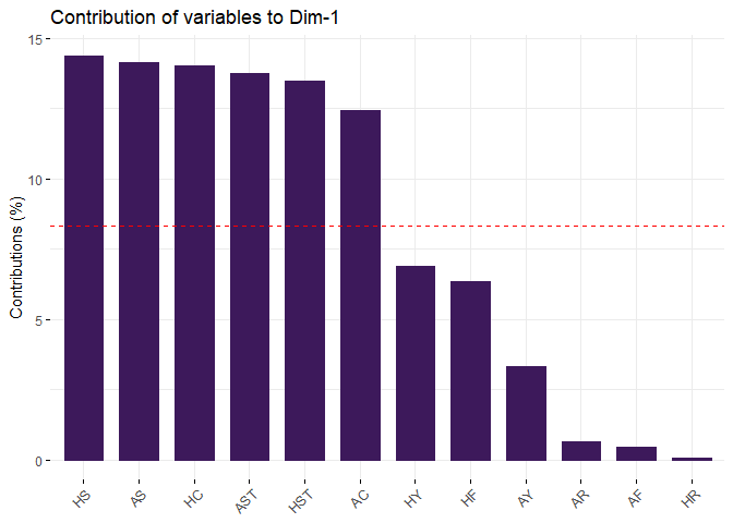
PC1 is attacked related, as high loadings are Home Team Shots, Away Team Shots, Home Team Shots on Target, Away Team Shots on Target, Home Team Corners and Away Team Corners, which explains 49.10% of variance. It is reasonable as attack is the best way to win a game in soccer, so as to explaining the game.
# Contributions of variables to PC2
fviz_contrib(pca, choice = "var", axes = 2, top = 12, fill = "#3d195b", color = "#3d195b")
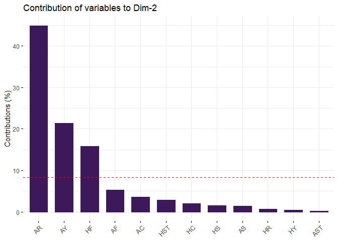
PC2 is a referre statistics, which seems referre related issue since both Home and Away Team are involved in the statistics. Major contributions are Home Team Fouls Committed, Away Team Yellow Cards and Away Team Red Cards. PC3 explains 11.31% variance.
# Contributions of variables to PC3
fviz_contrib(pca, choice = "var", axes = 3, top = 12, fill = "#3d195b", color = "#3d195b")
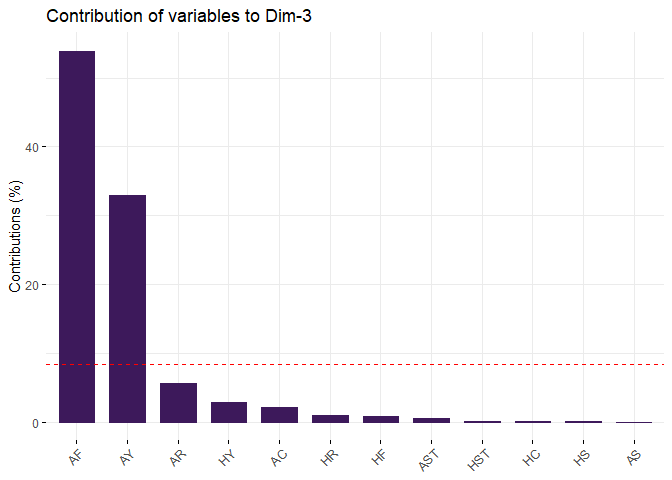
PC3 is Away Team foul play statistics. High loadings are Away Team Fouls Committed and Away Team Yellow Cards. PC3 explains 10.20% variance.
# Contributions of variables to PC4
fviz_contrib(pca, choice = "var", axes = 4, top = 12, fill = "#3d195b", color = "#3d195b")
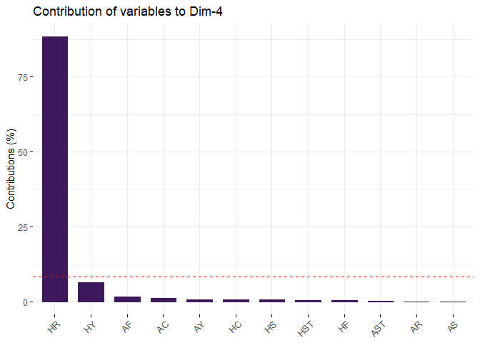
PC4 is Home Team Red Cards statistics. PC4 explains 8.87% variance.
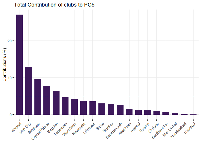
# Contributions of variables to PC5
fviz_contrib(pca, choice = "var", axes = 5, top = 12, fill = "#3d195b", color = "#3d195b")
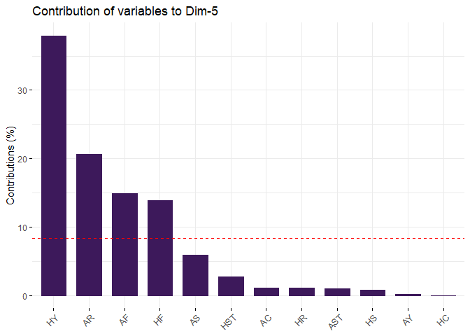
PC5 seems representing Home Team Advantage. The reason is the loadings of Home Team Fouls Committed and Away Team Fouls Committed are similar, but Away Team Red Cards is much higher than Home Team Yellow Cards. PC5 explains 8.32% variance. The correlation circle in Section 4.1provides graphical repsentation of this PC.
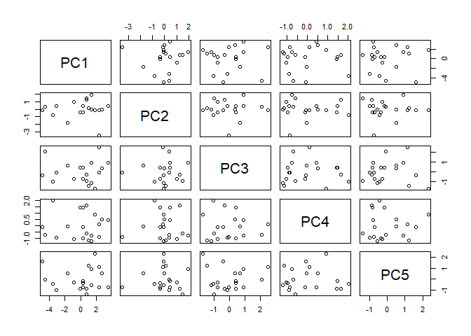
Scatter plot
score1 <- pca$x[, 1:5]
pairs(score1)
Findings
Correlation circle
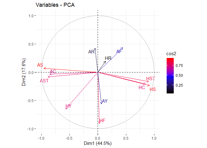
The correlation between a variable and a principal component (PC) is used as the coordinates of the variable on the PC. The representation of variables differs from the plot of the observations: The observations are represented by their projections, but the variables are represented by their correlations (Abdi and Williams 2010).
fviz_pca_var(pca,
  col.var = "cos2",
  gradient.cols = c("black", "blue", "red"),
  repel = TRUE # Avoid text overlapping
)
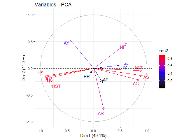
From the plot, positive correlated variables will group together. ‘Attack’ attributes are grouped together.
One interesting observation is home team fouls are positively related to yellow cards while negative related to red cards. Away teams are vice versa. This can be easily related to home advantage of field games. Referees may be more inclined to give minor punishment to home team while away teams have higher chance to get red cards for foul play. This is a strong support to PC5.
Quality and contribution
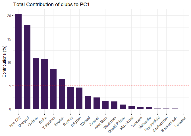
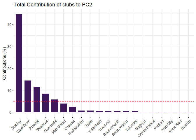
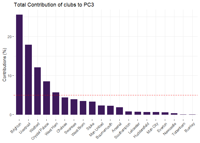
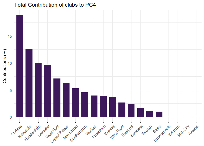
Below is a series of plots showing each club contribution in PCs
fviz_contrib(pca,
  choice = "ind",
  axes = 1,
  fill = "#3d195b",
  color = "#3d195b",
  title = "Total Contribution of clubs to PC1"
)
fviz_contrib(pca,
  choice = "ind",
  axes = 2,
  fill = "#3d195b",
  color = "#3d195b",
  title = "Total Contribution of clubs to PC2"
)
fviz_contrib(pca,
  choice = "ind",
  axes = 3,
  fill = "#3d195b",
  color = "#3d195b",
  title = "Total Contribution of clubs to PC3"
)
fviz_contrib(pca,
  choice = "ind",
  axes = 4,
  fill = "#3d195b",
  color = "#3d195b",
  title = "Total Contribution of clubs to PC4"
)
fviz_contrib(pca,
  choice = "ind",
  axes = 5,
  fill = "#3d195b",
  color = "#3d195b",
  title = "Total Contribution of clubs to PC5"
)
Biplot
Biplot is a combination of row data to PCs. Biplot visualize the data by assigning the PC1 and PC2 to X and Y Axis of Scatter chart like below.
fviz_pca_biplot(pca,
  repel = TRUE,
  col.var = "blue", # Variables color
  col.ind = "#3d195b" # Individuals color
)
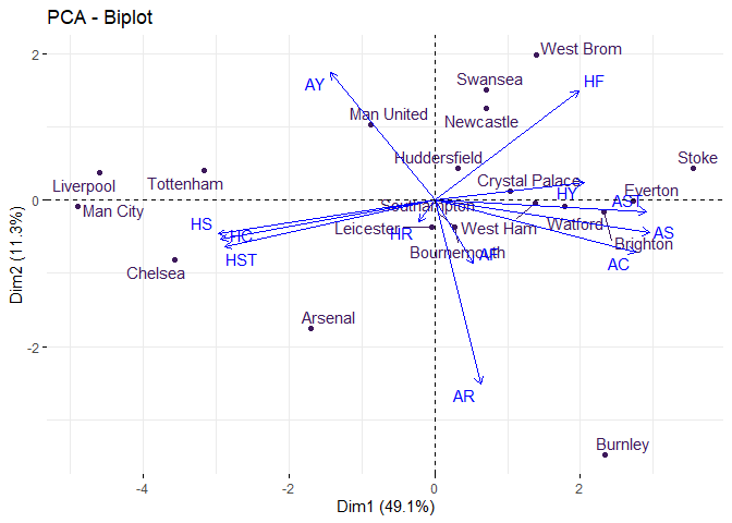 Blue arrows start from origin are
variables. Each club is shown as dot coming from the original rows.
Blue arrows start from origin are
variables. Each club is shown as dot coming from the original rows.
From the analysis, below are some major findings.
-
Manchester City and Chelsea are high in PC1, which translated to good home performance. Final standings of Chelsea was 5 and Manchester City was the champion. So strong home performance is a must in winning the league.
-
Low number in Foul can divide the club ranking. Left side clubs, Liverpool, Tottenham, Manchester City, Chelsea and Arsenal, are top 6 in final ranking. Manchester United seems an outliner in the elite group as it was the first runner-up but located at the middle of PC1. North-east region clubs, including West Bromwich Albion, Swansea City and Stoke City are high in PC2 which means more foul. Stoke City got high Home Yellow Cards too. Besides, these three teams are not good in both Home and Away attacks. According to the final ranking, these three teams performed worse and relegated in Season 2018-2019.
Loadings
(Loadings <- pca$rotation[, 1:5] %>%
  round(2) %>%
  data.frame() %>%
  mutate(Attribute = rownames(.)) %>%
  select(Attribute, everything()) %>%
  arrange(PC1))
##    Attribute   PC1   PC2   PC3   PC4   PC5
## 1         HS -0.38 -0.12 -0.02 -0.07  0.09
## 2        HST -0.37 -0.17  0.04 -0.06  0.16
## 3         HC -0.37 -0.14 -0.03 -0.08 -0.01
## 4         AY -0.18  0.46 -0.57  0.08  0.04
## 5         HR -0.03 -0.08 -0.10  0.94  0.10
## 6         AF  0.07 -0.23 -0.73 -0.12 -0.39
## 7         AR  0.08 -0.67 -0.24  0.02  0.45
## 8         HF  0.25  0.40 -0.09  0.06  0.37
## 9         HY  0.26  0.06 -0.17 -0.25  0.62
## 10        AC  0.35 -0.19  0.14  0.10 -0.10
## 11       AST  0.37 -0.04 -0.07 -0.03 -0.10
## 12        AS  0.38 -0.12  0.00 -0.01 -0.24
Plot time series of the Index by the clubs
d$PC1 <- pca$x[, 1]
d$PC2 <- pca$x[, 2]

d %>%
  ggplot() +
  geom_line(aes(x = as.Date(Date), y = PC1, group = 1), show.legend = F, colour = "#3d195b") +
  geom_hline(yintercept = 0, colour = "red") +
  facet_wrap(~HomeTeam) +
  labs(
    x = "Date",
    y = "PC1",
    title = "PC1 time series by clubs"
  ) +
  theme(axis.text.x = element_text(angle = 90, hjust = 1)) +
  scale_x_date(date_labels = "%Y (%b)")
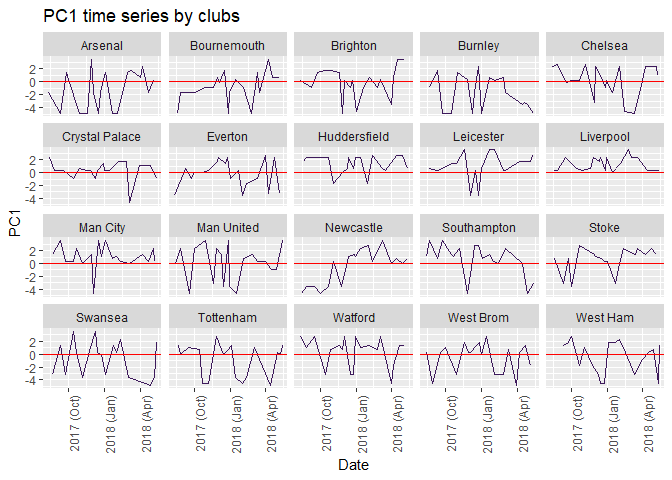
Manchester City kept PC1 mean above 0 all the time.
d %>%
ggplot() +
geom_line(aes(x = as.Date(Date), y = PC2, group = 1), show.legend = F, colour = "#3d195b") +
geom_hline(yintercept = 0, colour = "red") +
facet_wrap(~HomeTeam) +
labs(
x = "Date",
y = "PC2",
title = "PC2 time series by clubs"
) +
theme(axis.text.x = element_text(angle = 90, hjust = 1)) +
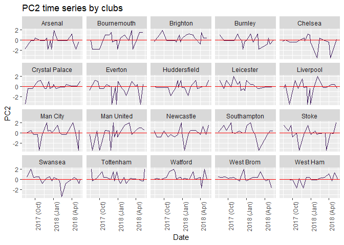
scale_x_date(date_labels = "%Y (%b)")
Mean of PC1 and PC2
d %>%
  group_by(HomeTeam) %>%
  summarise(
    Index.1 = mean(PC1),
    Index.2 = mean(PC2)
  ) %>%
  arrange(desc(Index.1)) %>%
  select(HomeTeam, Index.1, Index.2)
## # A tibble: 20 x 3
##    HomeTeam       Index.1  Index.2
##    <chr>            <dbl>    <dbl>
##  1 Huddersfield    1.37   -0.0243
##  2 Liverpool       1.27   -0.333
##  3 Man City        1.00   -0.0720
##  4 Leicester       0.880   0.244
##  5 Southampton     0.673   0.277
##  6 Stoke           0.604  -0.0573
##  7 Watford         0.403   0.428
##  8 Crystal Palace  0.309  -0.0218
##  9 Chelsea         0.248  -0.418
## 10 Man United      0.0243 -0.123
## 11 Brighton       -0.0300  0.437
## 12 Everton        -0.193  -0.498
## 13 West Ham       -0.429   0.00177
## 14 West Brom      -0.441   0.175
## 15 Newcastle      -0.483  -0.0838
## 16 Swansea        -0.725  -0.0748
## 17 Tottenham      -0.766   0.348
## 18 Bournemouth    -0.880   0.0496
## 19 Arsenal        -1.21   -0.221
## 20 Burnley        -1.62   -0.0335
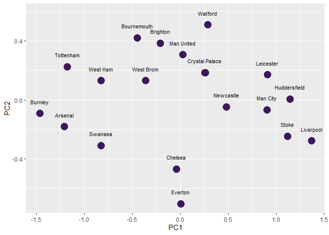
Rolling mean of PC1 and PC2
d %<>% group_by(HomeTeam) %>%
  arrange(Date) %>%
  mutate(
    M.A.PC1 = rollmeanr(PC1, 15, fill = NA),
    M.A.PC2 = rollmeanr(PC2, 15, fill = NA)
  )

Index.1718 <- d %>%
  group_by(HomeTeam) %>%
  filter(Date == max(Date)) %>%
  select(HomeTeam, M.A.PC1, M.A.PC2, Date) %>%
  arrange(M.A.PC1)

ggplot(Index.1718, aes(x = M.A.PC1, y = M.A.PC2)) +
  geom_point(show.legend = F, colour = "#3d195b", size = 5) +
  geom_text(aes(label = HomeTeam),
    check_overlap = TRUE, nudge_y = 0.08,
    show.legend = F, size = 2.9
  ) +
  labs(x = "PC1", y = "PC2")
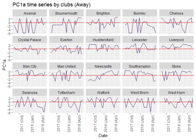
Away Team Analysis
For complete demonstration, Away Team PCA is carried out as below.
d2 <- d %>%
  group_by(AwayTeam) %>%
  summarise(
    HS = sum(HS),
    AS = sum(AS),
    HST = sum(HST),
    AST = sum(AST),
    HF = sum(HF),
    AF = sum(AF),
    HC = sum(HC),
    AC = sum(AC),
    HY = sum(HY),
    AY = sum(AY),
    HR = sum(HR),
    AR = sum(AR)
  )
away.df <- column_to_rownames(d2, var = "AwayTeam")
(away.df)
##                 HS  AS HST AST  HF  AF  HC  AC HY AY HR AR
## Arsenal        238 250  79  87 194 197  86  93 25 32  2  1
## Bournemouth    292 199  91  75 232 172 126 102 37 24  0  0
## Brighton       312 166  94  47 141 215 130  73 13 17  1  1
## Burnley        299 172  84  61 214 183 130  73 27 38  2  0
## Chelsea        209 250  69  88 195 180  89  82 40 22  0  1
## Crystal Palace 256 208  95  60 199 210 113 105 34 33  1  0
## Everton        301 171 102  62 187 225 113  69 23 23  3  2
## Huddersfield   255 153  88  56 197 216 126  63 23 35  3  1
## Leicester      274 195  99  73 172 185 127  91 24 30  0  3
## Liverpool      164 281  66  98 163 178  64  96 21 26  0  1
## Man City       132 317  47 110 186 175  56 146 36 32  1  1
## Man United     260 238  81  88 216 200 100 103 35 35  1  1
## Newcastle      261 225  92  79 184 202 128  84 27 29  0  0
## Southampton    270 199  96  68 197 226 112 102 25 34  1  2
## Stoke          314 179 123  66 194 217 153  56 26 32  0  0
## Swansea        316 122 105  35 201 181 114  55 28 27  0  1
## Tottenham      184 269  64  97 205 207  89 103 39 29  1  2
## Watford        204 204  79  62 187 217 106  88 27 22  0  2
## West Brom      286 165  89  49 193 210  89  75 25 37  1  1
## West Ham       335 162 115  69 226 186 130  68 27 38  0  2
summary(away.df)
##        HS              AS             HST              AST
##  Min.   :132.0   Min.   :122.0   Min.   : 47.00   Min.   : 35.00
##  1st Qu.:230.8   1st Qu.:169.8   1st Qu.: 79.00   1st Qu.: 60.75
##  Median :265.5   Median :199.0   Median : 90.00   Median : 68.50
##  Mean   :258.1   Mean   :206.2   Mean   : 87.90   Mean   : 71.50
##  3rd Qu.:299.5   3rd Qu.:241.0   3rd Qu.: 96.75   3rd Qu.: 87.25
##  Max.   :335.0   Max.   :317.0   Max.   :123.00   Max.   :110.00
##        HF              AF              HC              AC
##  Min.   :141.0   Min.   :172.0   Min.   : 56.0   Min.   : 55.00
##  1st Qu.:186.8   1st Qu.:182.5   1st Qu.: 89.0   1st Qu.: 72.00
##  Median :194.5   Median :201.0   Median :113.0   Median : 86.00
##  Mean   :194.2   Mean   :199.1   Mean   :109.0   Mean   : 86.35
##  3rd Qu.:202.0   3rd Qu.:215.2   3rd Qu.:127.2   3rd Qu.:102.00
##  Max.   :232.0   Max.   :226.0   Max.   :153.0   Max.   :146.00
##        HY              AY              HR             AR
##  Min.   :13.00   Min.   :17.00   Min.   :0.00   Min.   :0.00
##  1st Qu.:24.75   1st Qu.:25.50   1st Qu.:0.00   1st Qu.:0.75
##  Median :27.00   Median :31.00   Median :1.00   Median :1.00
##  Mean   :28.10   Mean   :29.75   Mean   :0.85   Mean   :1.10
##  3rd Qu.:34.25   3rd Qu.:34.25   3rd Qu.:1.00   3rd Qu.:2.00
##  Max.   :40.00   Max.   :38.00   Max.   :3.00   Max.   :3.00
ggplot(stack(away.df), aes(x = ind, y = values)) +
  geom_boxplot(fill = "#3d195b", colour = "red") +
  labs(
    x = "Variables",
    y = "Values",
    title = "Boxplot for 12 variables"
  )
pca2 <- prcomp(away.df, center = TRUE, scale = TRUE)
summary(pca2)
## Importance of components:
##                           PC1    PC2    PC3     PC4     PC5     PC6     PC7
## Standard deviation     2.3100 1.4542 1.1921 0.96504 0.81775 0.76849 0.59752
## Proportion of Variance 0.4447 0.1762 0.1184 0.07761 0.05573 0.04922 0.02975
## Cumulative Proportion  0.4447 0.6209 0.7393 0.81692 0.87264 0.92186 0.95161
##                            PC8     PC9    PC10    PC11    PC12
## Standard deviation     0.53131 0.38977 0.30503 0.22007 0.07058
## Proportion of Variance 0.02352 0.01266 0.00775 0.00404 0.00042
## Cumulative Proportion  0.97514 0.98780 0.99555 0.99958 1.00000
fviz_pca_var(pca2,
  col.var = "cos2",
  gradient.cols = c("black", "blue", "red"),
  repel = TRUE # Avoid text overlapping
)
d$PC1a <- pca2$x[, 1]
d$PC2a <- pca2$x[, 2]

d %>%
  ggplot() +
  geom_line(aes(x = as.Date(Date), y = PC1a, group = 1), show.legend = F, colour = "#3d195b") +
  geom_hline(yintercept = 0, colour = "red") +
  facet_wrap(~HomeTeam) +
  labs(
    x = "Date",
    y = "PC1a",
    title = "PC1a time series by clubs (Away)"
  ) +
  theme(axis.text.x = element_text(angle = 90, hjust = 1)) +
  scale_x_date(date_labels = "%Y (%b)")
d %>%
ggplot() +
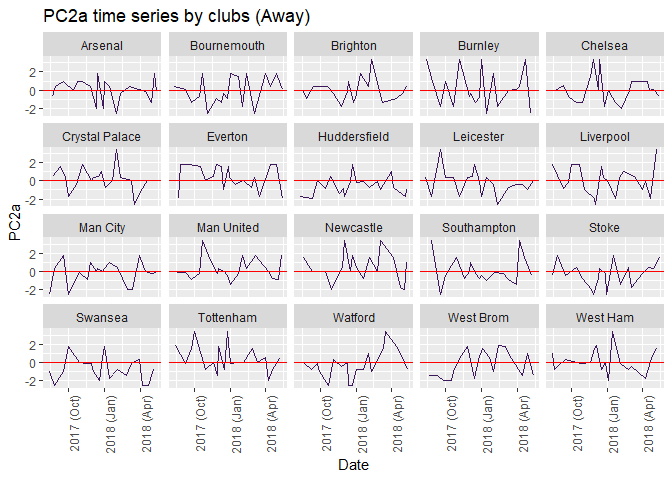
geom_line(aes(x = as.Date(Date), y = PC2a, group = 1), show.legend = F, colour = "#3d195b") +
geom_hline(yintercept = 0, colour = "red") +
facet_wrap(~AwayTeam) +
labs(
x = "Date",
y = "PC2a",
title = "PC2a time series by clubs (Away)"
) +
theme(axis.text.x = element_text(angle = 90, hjust = 1)) +
scale_x_date(date_labels = "%Y (%b)")
d %>%
  group_by(AwayTeam) %>%
  summarise(
    Index.1 = mean(PC1a),
    Index.2 = mean(PC2a)
  ) %>%
  arrange(desc(Index.1)) %>%
  select(AwayTeam, Index.1, Index.2)
## # A tibble: 20 x 3
##    AwayTeam       Index.1   Index.2
##    <chr>            <dbl>     <dbl>
##  1 Arsenal         0.445  -0.0215
##  2 Burnley         0.414   0.212
##  3 Tottenham       0.365   0.442
##  4 Man City        0.274  -0.158
##  5 Swansea         0.242  -0.695
##  6 Huddersfield    0.216  -0.569
##  7 West Brom       0.206  -0.238
##  8 Brighton        0.156   0.000481
##  9 Chelsea         0.134   0.0689
## 10 Watford         0.0281 -0.242
## 11 Southampton    -0.0171  0.109
## 12 Newcastle      -0.0298  0.464
## 13 Leicester      -0.0617 -0.166
## 14 Stoke          -0.127  -0.283
## 15 Man United     -0.153   0.351
## 16 West Ham       -0.180   0.154
## 17 Liverpool      -0.185   0.0610
## 18 Everton        -0.404   0.379
## 19 Crystal Palace -0.491   0.204
## 20 Bournemouth    -0.830  -0.0703
Huddersfield Town[3] is an outliner. Final standing was not high but got good home performance. Part of the reasons maybe the turnaround matches in the League, which drew big clubs like Chelsea and Manchester United.
Conclusion
Principal componenet analysis can sort out the winning elements and help club managers to run their clubs.
Principal component analysis can represent infomration in a lower dimension which can make analysis easier to handle and find out different aspects of factors. If analysers focus on first few PCs, they can make a model with better performance.
Reference
-
Applied Multivariate Statistical Analysis, 5th ed., Richard Johnson and Dean Wichern, Prentice Hall.
-
Principal Component Analysis (PCA) 101, using R, Peter Nistrup, https://towardsdatascience.com/principal-component-analysis-pca-101-using-r-361f4c53a9ff
-
Principal Component Analysis in R: prcomp vs princomp, Statistical tools for high-throughput data analysis, http://www.sthda.com/english/articles/31-principal-component-methods-in-r-practical-guide/118-principal-component-analysis-in-r-prcomp-vs-princomp/
-
How to rate the performance of a soccer team? An application of Principal Components Analysis, https://fcostartistician.wordpress.com/2017/05/22/how-to-rate-the-performance-of-a-soccer-team-an-application-of-principal-components-analysis/
-
Principal Component Analysis (PCA) with FactoMineR(decathlon dataset)François Husson & Magalie Houée-Bigot, http://factominer.free.fr/course/doc/RMarkdown_PCA_Decathlon.pdf
-
Principal Component Analysis, 2nd ed., I.T. Jolliffe, Springer.
[1] Leading: Learning from Life and My Years at Manchester United by Alex Ferguson, Michael Moritz (With). ISBN 9780316268080
tags: test - PCA