iyeung144.github.io
My Github Pages
COVID-19 Confirmed Cases in Hong Kong
by Yeung Ka Ming, CFA
Summary
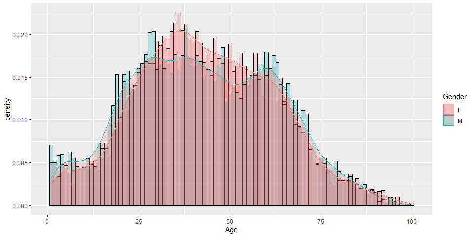
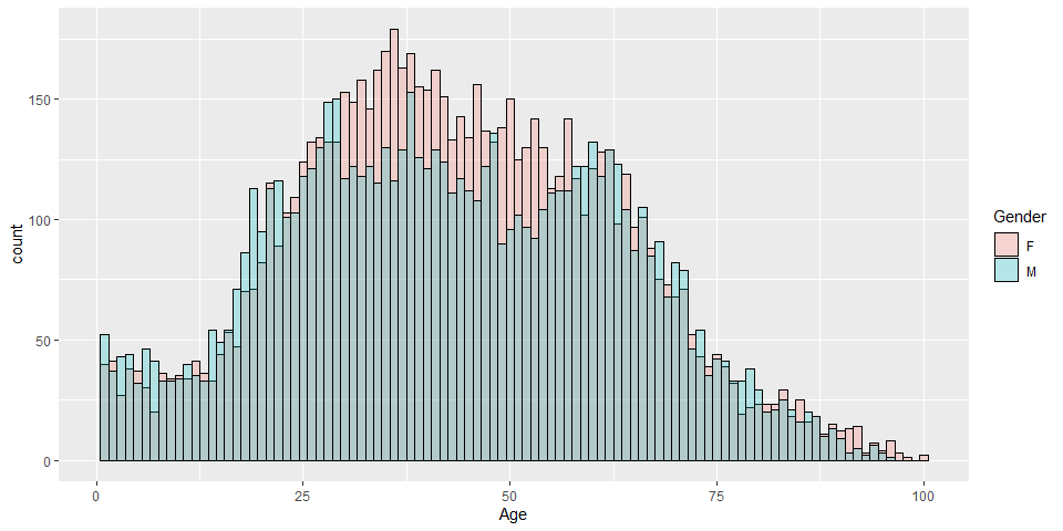
COVID-19 confirmed cases by age and gender in Hong Kong
R Libraries
library(ggplot2)
library(tidyverse)
Preparation of data
Download data from WHO website
enhanced_sur_covid_19_eng <- read.csv("d:/Users/ivan/Downloads/enhanced_sur_covid_19_eng.csv")
hkcovid.tbl <- as_tibble(enhanced_sur_covid_19_eng)

hkcovid1.tbl <- hkcovid.tbl %>%
  mutate(Report.date = as.Date(Report.date, format = "%d/%m/%Y"),
         Date.of.onset = as.Date(Date.of.onset, format = "%d/%m/%Y"))
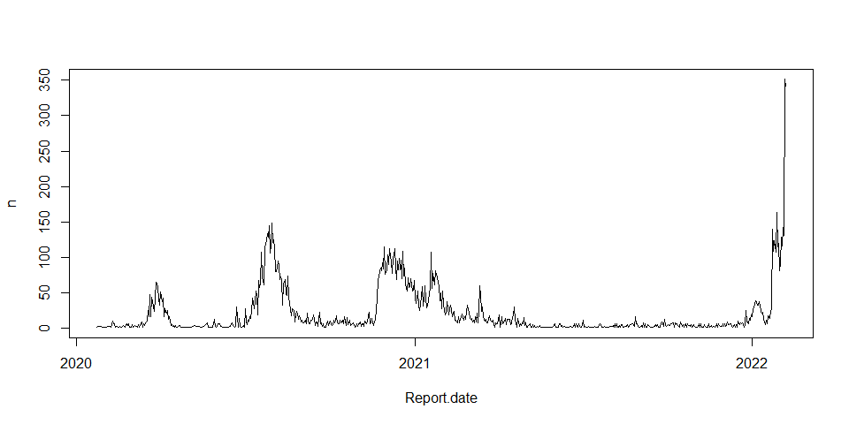
Simple plot date vs confirmed cases
hkcovid1.tbl %>%
  group_by(Report.date) %>%
  summarise(n = n()) %>%
  plot(type = "l")
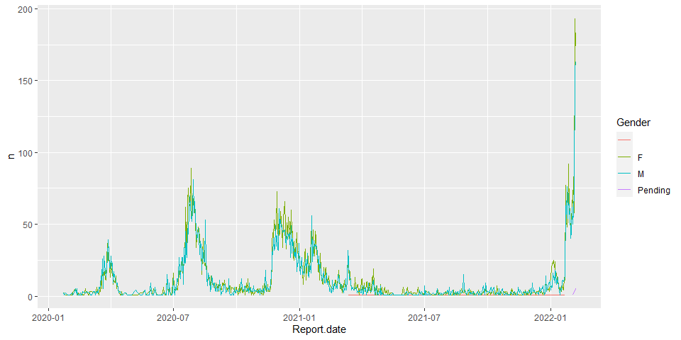
date vs gender
hkcovid2.tbl <- hkcovid1.tbl %>%
  group_by(Report.date, Gender) %>%
  summarise(n = n())
p <- ggplot(hkcovid2.tbl, aes(x=Report.date, y=n, color=Gender))
p+geom_line()
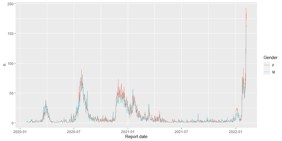
hkcovid2.tbl <- hkcovid1.tbl %>%
  group_by(Report.date, Gender) %>%
  filter(Gender == 'M' | Gender == 'F') %>%
  summarise(n = n())
p1 <- ggplot(hkcovid2.tbl, aes(x=Report.date, y=n, color=Gender))
p1+geom_line(aes(linetype=Gender))+scale_size_manual(values=c(2, 2.5))
histogram
hkcovid3.tbl <- hkcovid1.tbl %>%
  group_by(Age,Gender) %>%
  filter(Gender == 'M' | Gender == 'F')
hkcovid4.tbl <- hkcovid3.tbl %>%
  mutate(Age = as.integer(Age))
p2 <- ggplot(hkcovid4.tbl,
            aes(x=Age, color=Gender, fill=Gender)) +
  geom_histogram(binwidth=1, color="Black", position="identity", alpha=0.25)
p2
p3 <- ggplot(hkcovid4.tbl,
             aes(x=Age, color=Gender, fill=Gender)) +
  geom_histogram(binwidth=1,
                 color="Black",
                 position="identity",
                 alpha=0.25,
                 aes(y=..density..)) +
  geom_density(alpha=.2, fill="#FF6666")
p3